Hangout in City Parks
Usability Testing | Website Redesign | Information Architecture
A website re-design for a non-profit organization.
City Parks Foundation
A website re-design for a non-profit organization.
City Parks Foundation
Team
Alyce Currier, Lemark McPherson and Kate Nadel
Alyce Currier, Lemark McPherson and Kate Nadel
Role
UX Research, Usability Tests,Visual Design
UX Research, Usability Tests,Visual Design
Impact
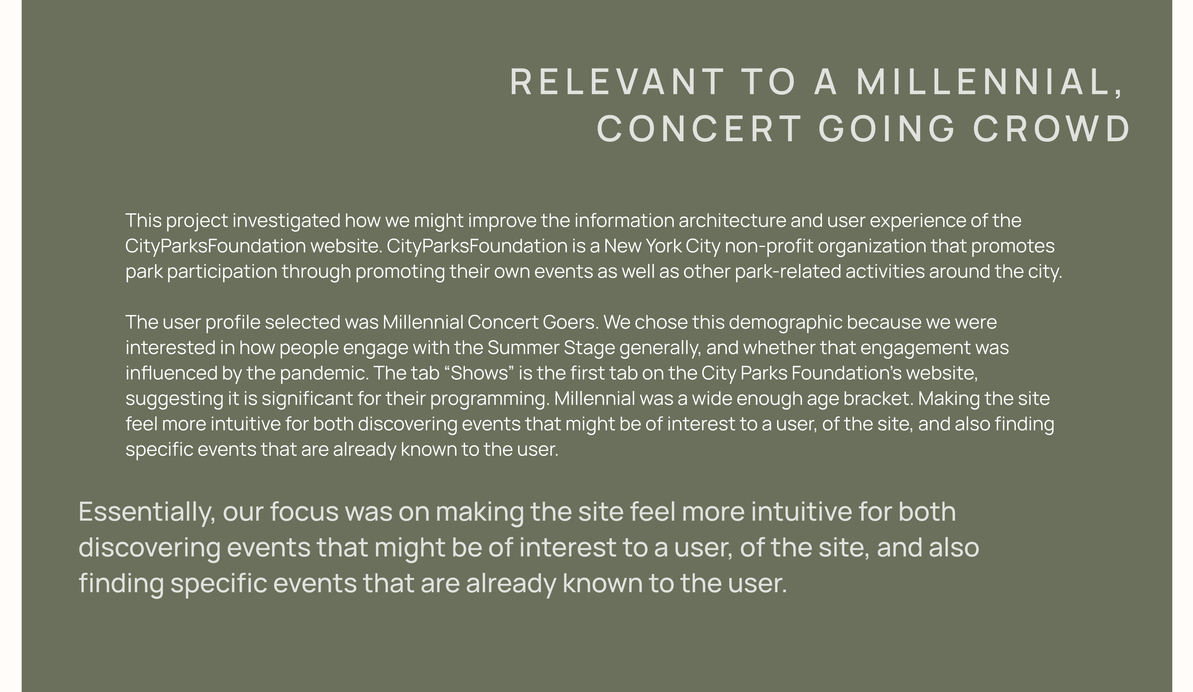
1. Making the site intuitive for finding events that may be of interest and specific events that the user already knows.
2. Helped the team visually express all of the research that led up to the final wireframes.
1. Making the site intuitive for finding events that may be of interest and specific events that the user already knows.
2. Helped the team visually express all of the research that led up to the final wireframes.
Tools
Figma, Miro, Optimal Workshop Google forms
Figma, Miro, Optimal Workshop Google forms
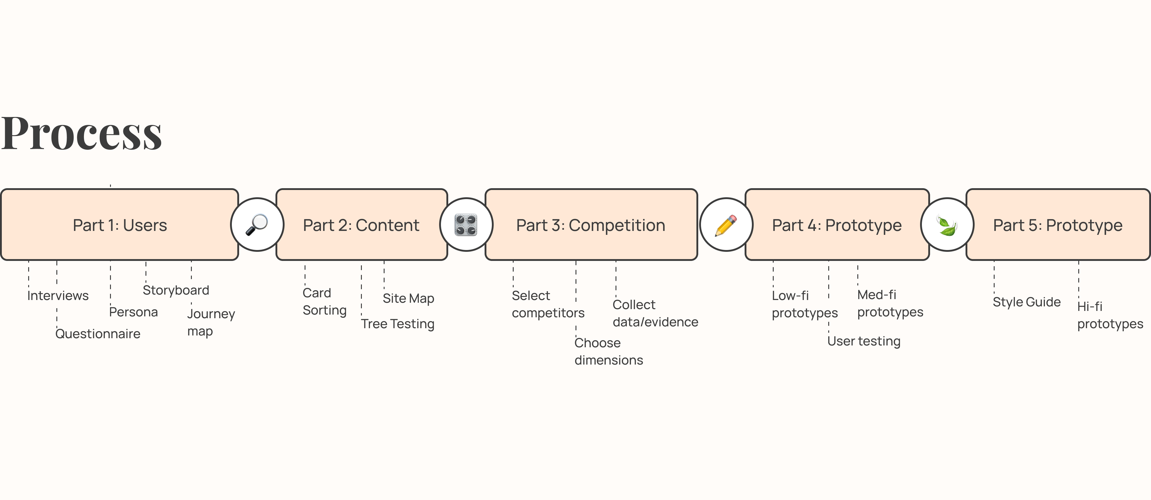
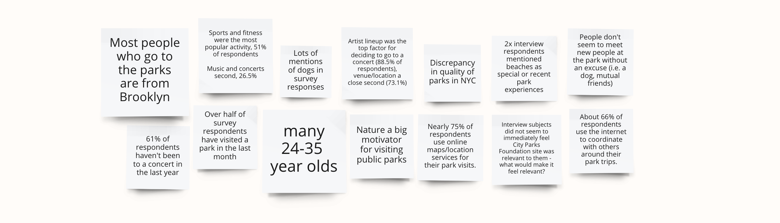
As a group we decided on 15 questions for the questionnaire, and 20 questions for the interview. The questionnaire focussed on gathering quantitative data while the interviews focussed on gathering narrative data about the participants’ experiences when visiting the parks. The data required cleaning and analyzing after receiving the results. For the survey, we had to narrow down fields where participants could type their answers, such as consolidating “Brooklyn, NYC,” “Brooklyn,” “Brooklyn NY,” etc.
- 84.3% and 82.4% of respondents stated they received information about concerts from social media and friends, respectively. These findings suggest that one of the challenges of the web redesign will be making the website feel relevant to a group that may rely on more social sources of sharing information.
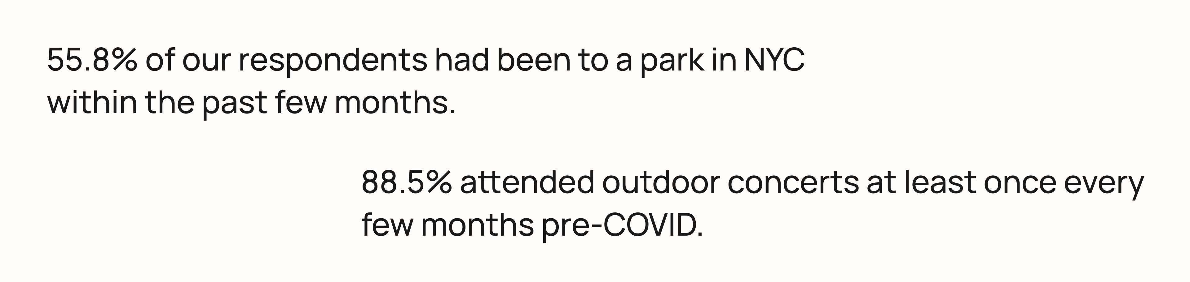
- Before the pandemic, 88.5% of participants would attend outdoor concerts at least once every few months (during weather appropriate months). Shows the interest in outdoor concerts, and that the possibility of using the website to draw attention to other outdoor activities is realistic.
- Many participants expect to find historical information and maps of the park on the city park website. Participants largely expect to find maps of the park, history about the park, and logistical information such as the location of bathrooms, hours of operation, accessibility information on a park website.
- Within the past few months, 55.8% of the respondents had been to a park in NYC. More than half of the participants had been to a public park within the past month, with 32.7% of the participants having been to a park within the past week. These findings suggest that regardless of season, parks are frequently visited by this demographic.

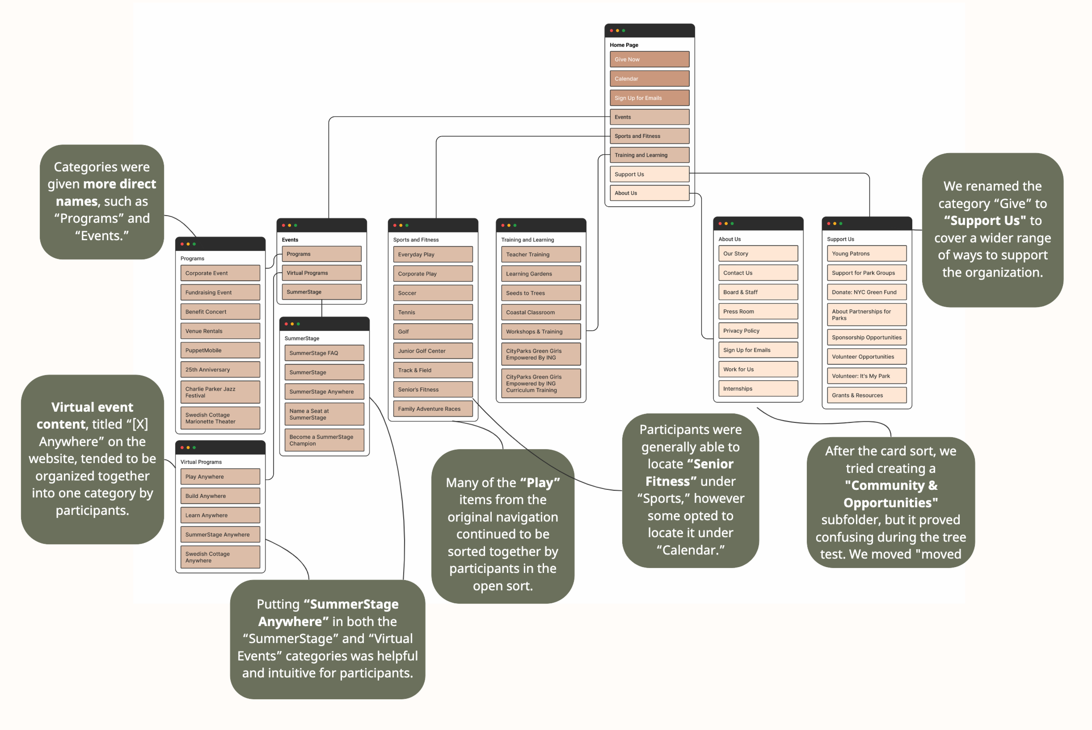
To create our revised site map we used a card sorting study and a tree testing study to analyze our proposed changes to the existing structure of cityparksfoundation.org.

We completed two separate card sorts, open and closed, the main findings are:
- Many of the “Play” items from the original navigation continued to be sorted together by participants in the open sort. Suggested titles included “Sports,” “Fitness Center,” “Activities,” and “Athletics.”
- Participants tended to cluster SummerStage-related items together into their own “SummerStage” category.
- Virtual event content, titled “[X] Anywhere” on the website, tended to be organized together into one category by participants into a “Digital Content,” “Virtual Events,” or “Digital Programs” category.
-
Categories were given more direct names, such as “Activities/Programs” and “Events.”
-
Participants created categories titled “Opportunities” and “Community” in addition to “Contact.”

Tree testing allowed us to determine the efficacy of our changes. We asked 8 participants to complete 3 tasks related to finding information based on our first draft of the site map:
- When asked to find a virtual event offered by the SummerStage, 86% of the participants were able to easily find the right page. However, most of the participants found the page by going directly to the SummerStage tab, rather than through “Virtual Events.”
- Many participants struggled to find the page with information about internships when it was nested under “Community and Opportunities” in the category “Support Us.”
-
Participants were generally able to locate “Senior Fitness” under “Sports,” however some opted to locate it under “Calendar.”
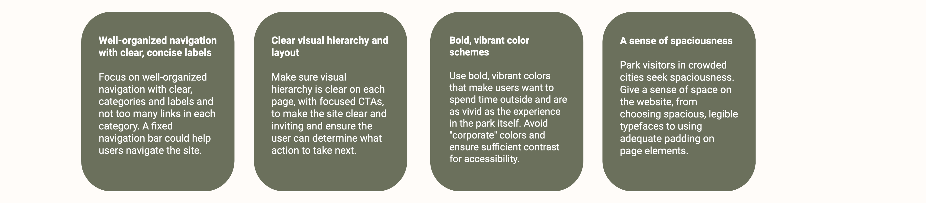
What we learned through our competitive reviews were that we needed to pay attention to:
- The navigation bars and labelling.
- Creating a visual heirarchy for content and methods of engaging with the content (what do we MOST want a user to do, in what order, etc.)
- Use of color scheme (city parks foundation felt very corporate, we wanted to move away from that)
- Since it’s about parks, to create a feeling of spaciousness througout the site.

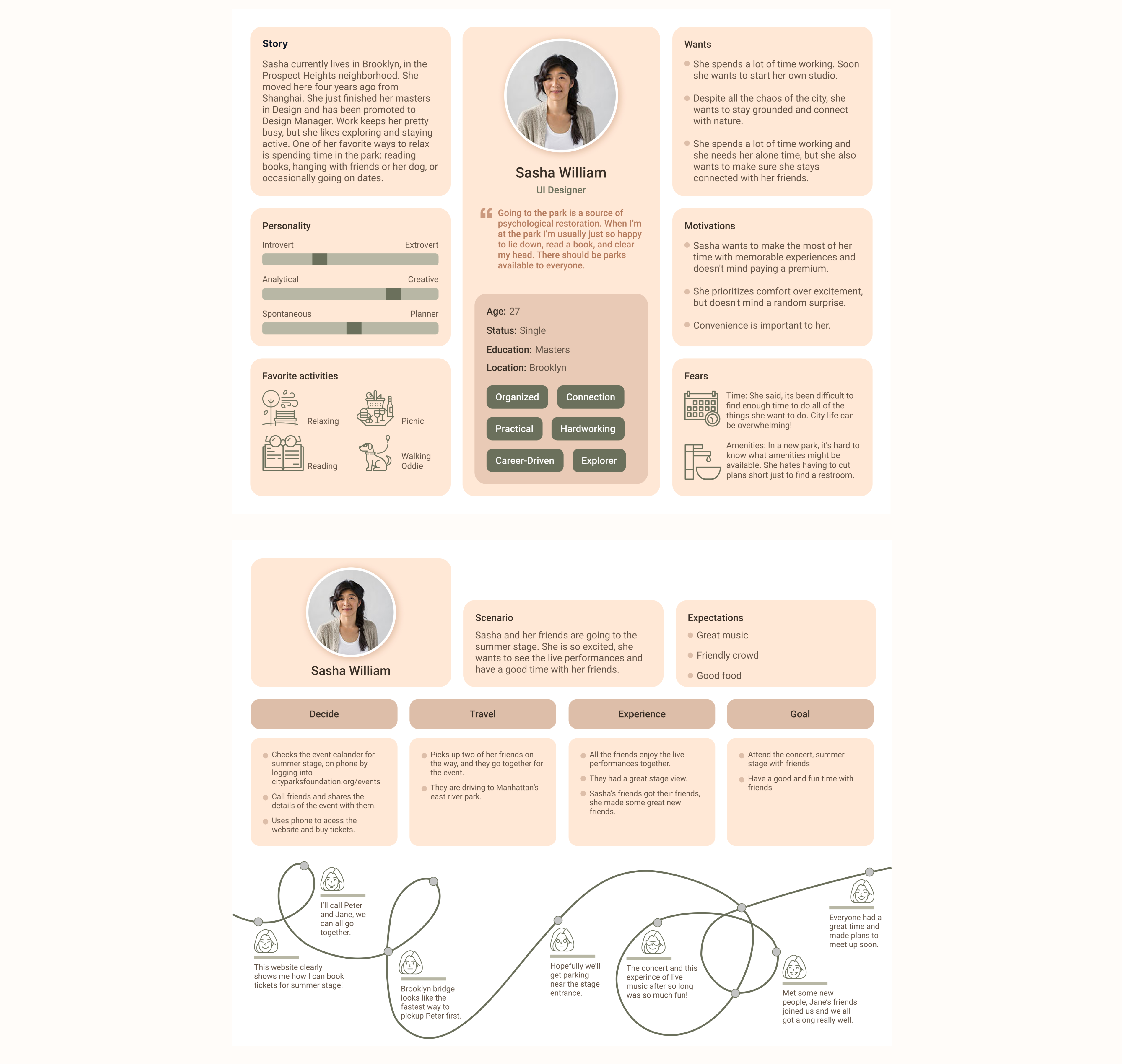
By focusing in on events, virtual events, SummerStage, and the calendar view, we hoped to glean insight about how users intuitively navigate our redesign, and any deviations from how we would expect users to retrieve information, our group created two tasks for our testing users to complete. We drew up desktop and mobile paper prototypes. The prototypes were scanned and uploaded to Figma as interactive prototypes. Eight participants completed the test remotely while observed by a member of our group.
Task 1 (mobile) | Task 1 (desktop) | Task 2 (mobile) | Task 2 (desktop)
Task 1 (mobile) | Task 1 (desktop) | Task 2 (mobile) | Task 2 (desktop)
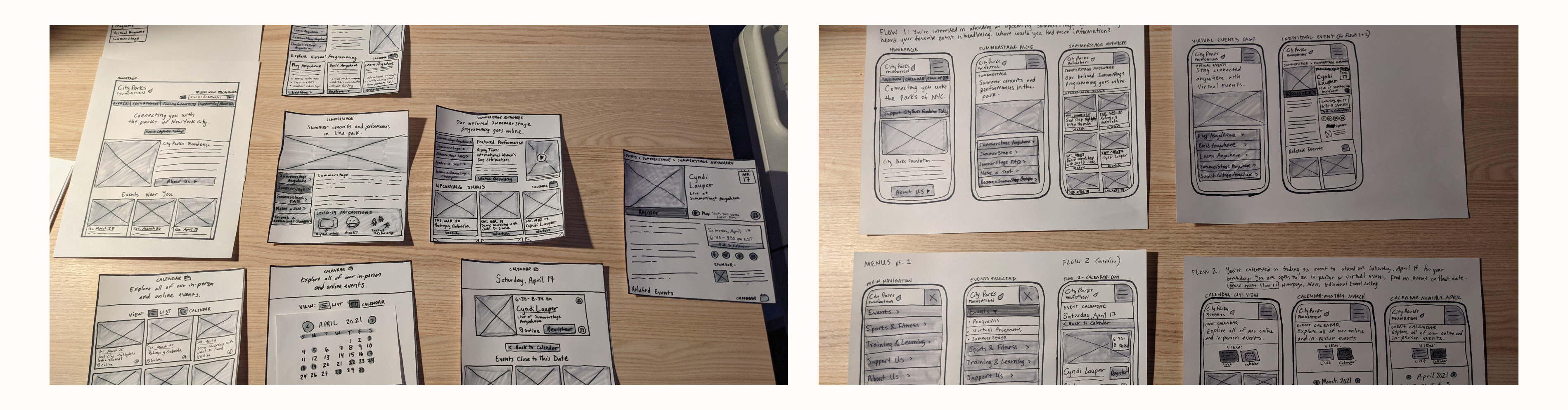

The low fidelity prototype confirmed that people use a mix of direct paths to find events (such as going to events>summerstage>event page) AND going directly through via a calendar app. This was helpful feedback because for our card sorting and tree testing, most participants went directly to the calendar view, this demonstrated that our design helped visitors find events in multiple ways that were all still direct and clear.
Generally our paper prototyping tests yielded positive results, users were able to find information about virtual events and events on a specific date with ease. Our main findings revealed that the most confusion came from instances where information was repetitive. Moving forward, our group plans to consolidate any repetitive information and pages and remove icons that can be misleading. While we appreciate that users might have different intuitions about how to access information on the City Parks Foundation’s website, we want to make the process as straightforward as possible.
Generally our paper prototyping tests yielded positive results, users were able to find information about virtual events and events on a specific date with ease. Our main findings revealed that the most confusion came from instances where information was repetitive. Moving forward, our group plans to consolidate any repetitive information and pages and remove icons that can be misleading. While we appreciate that users might have different intuitions about how to access information on the City Parks Foundation’s website, we want to make the process as straightforward as possible.

I decided to work on the landing page and events as it was a fantastic opportunity for me to re-imagine this page and show the information more effectively. To achieve the vision, I adopted a few design principles. These design ideas helped ensure that the whole website flowed around being Clear, Intuitive, and Seamless.
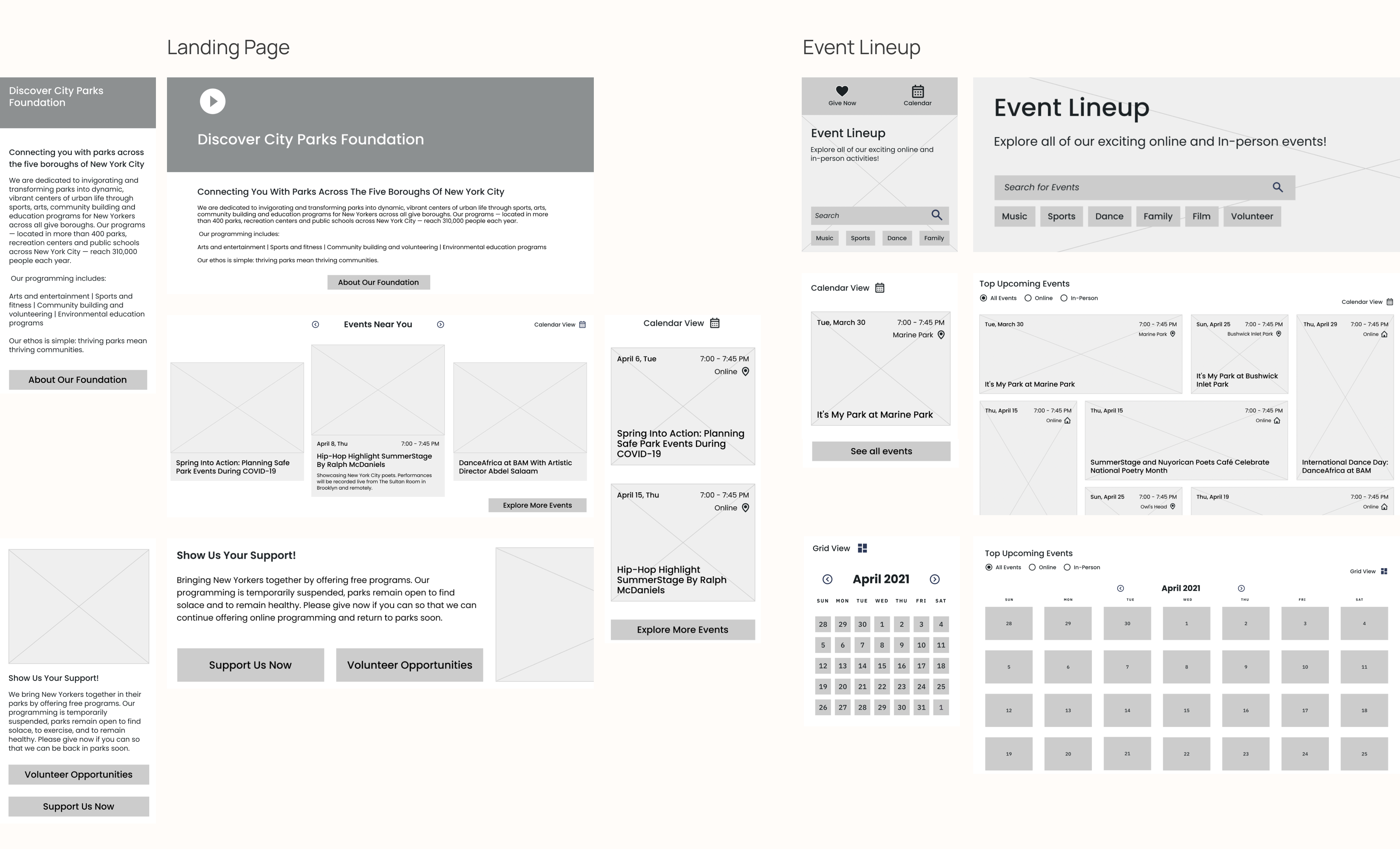
Hero Image
The goal was to direct users to learning about the City Parks foundation by effectively utilizing the hero image to catch the prospect's attention to the call to action button.Events carousel
The carousel is an efficient means of showing several photos and event information in a container. It not only uses lesser screen real estate, but it also encourages users to focus on essential information, and shows extra details for the selected component.Support section
The support CTA takes visitors to a page that provides them with more options and alternative ways to donate. Including a donation section on the landing page is an effective way to encourage users to interact with the content in order to support the cause.Search and Tag
Search bar will allow users to find what they’re looking for quickly and the tags will give them the option to find specific events faster. It can also be integrated into analytics, to see how often people search for something particular. For mobile, search function would ease the experience to avoid complex navigation.Grid View
Month view is useful for communicating the time of the event and with images, it does a fantastic job of emphasizing the content of the event, bringing it to life, users will be able to scan many events and quickly find the ones they are looking for. The images also help in communicating the atmosphere and culture of an event.Calender View
Users can see at a glance everything that will happen during the month or see events by month to see what's coming up. If there aren't many events coming up, this approach does an excellent job of highlighting certain dates having events. It is also preferable to keep consumers on the main calendar page rather than visiting individual event sites.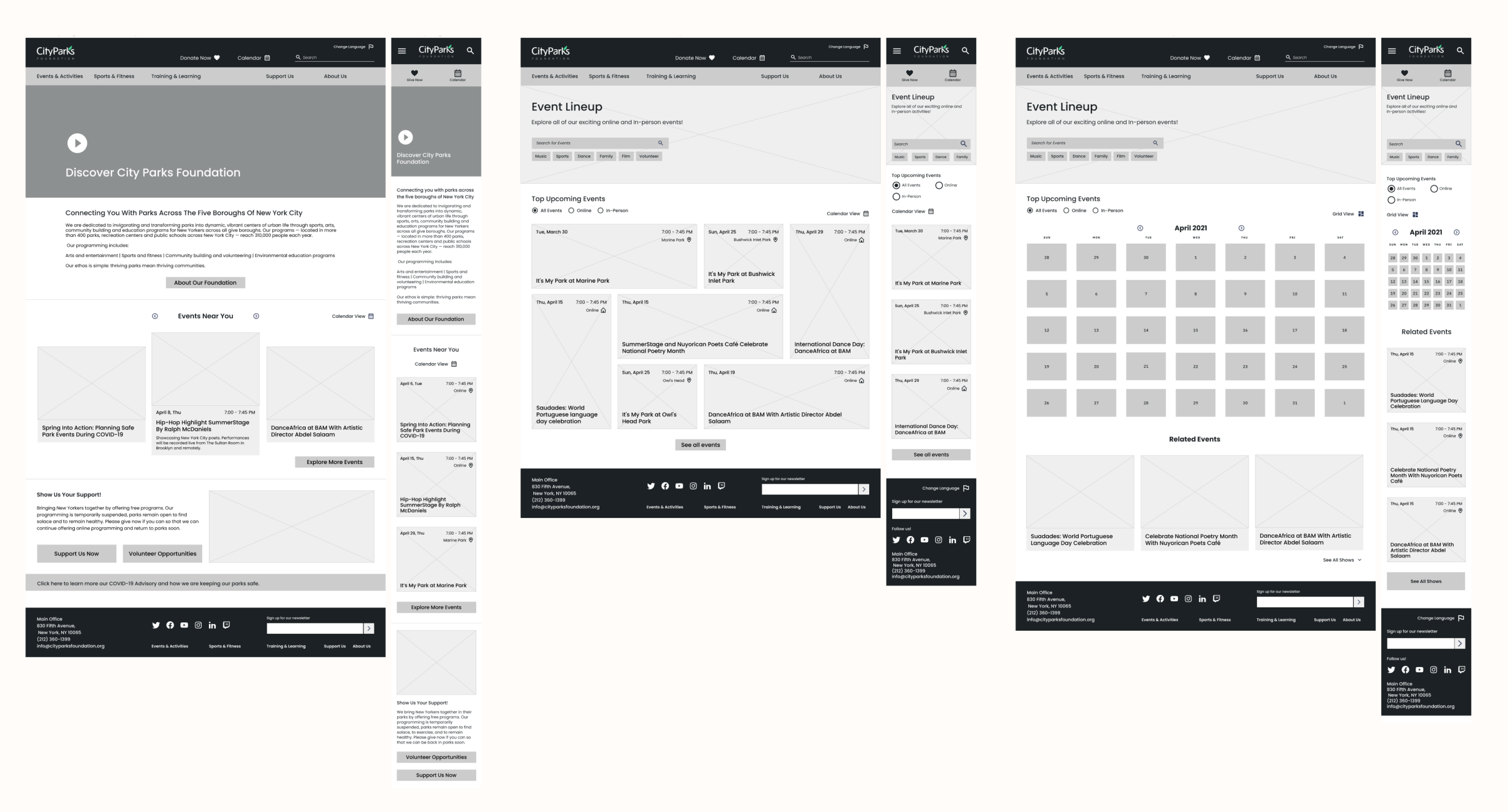
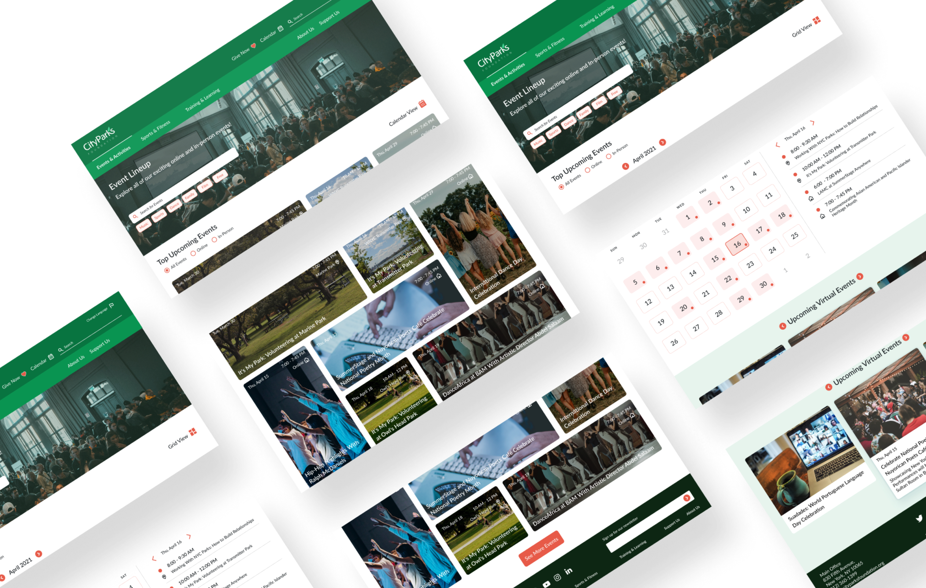
Significant elements of the design process were color, navigation bars, repetitive elements, drawing visitors to interact and engage.
Greens for spaciousness, greenery, natural - with a pinkish hue as an accent to create some contrast and make the layout feel less monochromatic. Use of the salmon colored buttons for action items such as “explore more events,” and a secondary button styling for things like covid updates or “donate now.” The font and layout grid were chosen to embody the feeling of spaciousness.
Access the Style Guide here
After finalizing the content and structure, it was essential to make the website aesthetically pleasing. It was also crucial to reflect all our findings, design goals, and design principles.
I decided final design for the landing page and events that was aesthetically good and presented all the information rightly.
Desktop Prototype | Mobile Prototype
I decided final design for the landing page and events that was aesthetically good and presented all the information rightly.
Desktop Prototype | Mobile Prototype
Reflection✨
I genuinely feel that the value of research in any activity should never be underestimated. It was intriguing to observe to see how each aspect of the system was essential and effective to the other in this project.
User testing sessions would have been the next phase in this project's development. We might also consider approaches to broaden the scope of the project and make the entire website more fluid by maintaining a consistent design and visual language.