Assessing usability with Eye-Tracking
Moderated User Testing | Eye-Tracking | User Research
Understanding engagement of content through interaction for Cooper Hewitt’s website with Eye-Tracking analysis.
Cooperhewitt.org
Understanding engagement of content through interaction for Cooper Hewitt’s website with Eye-Tracking analysis.
Cooperhewitt.org
Worked with
Jamie Chen, Wenjing Wu,
Derek Frisicchio
Jamie Chen, Wenjing Wu,
Derek Frisicchio
My Role
UX Researcher, Conducted eye-tracking with 2 participants
UX Researcher, Conducted eye-tracking with 2 participants
Impact
1. Designed and plan the usability tests to moderate and observe particiapnts
2. Supported the team in analyzing the results to obtain meaningful findings, which were then collected into recommendations fit with the study's goal.
1. Designed and plan the usability tests to moderate and observe particiapnts
2. Supported the team in analyzing the results to obtain meaningful findings, which were then collected into recommendations fit with the study's goal.
Tools
Figma, Miro, Google forms, Tobii, Tobii Pro Lab (software and device)
Figma, Miro, Google forms, Tobii, Tobii Pro Lab (software and device)

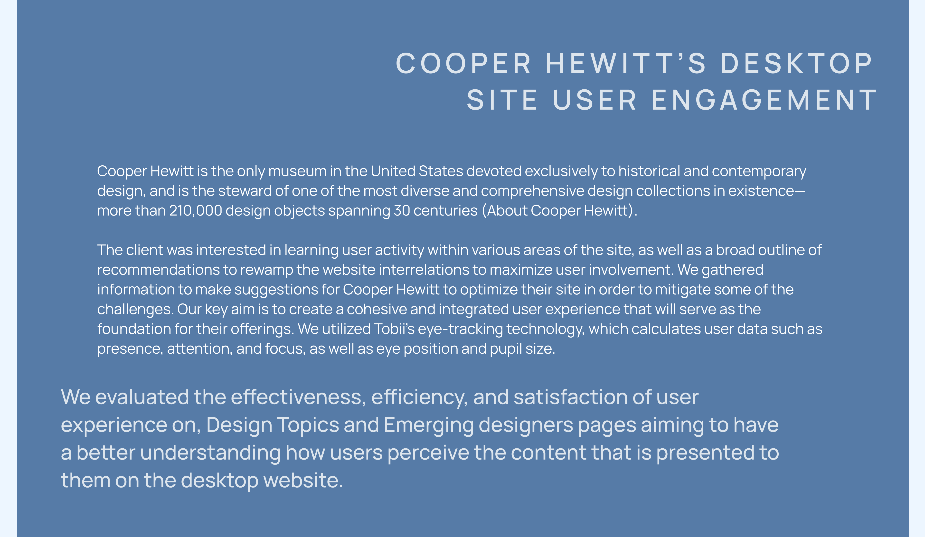

The client believes that strengthening the user experience on the Cooper Hewitt website would enable them accomplish their business goals. If an user spends more time on information, spends less time looking for content, and has fewer failures in discovering that content, they will ultimately recognize and depend on the website as a beneficial resource.
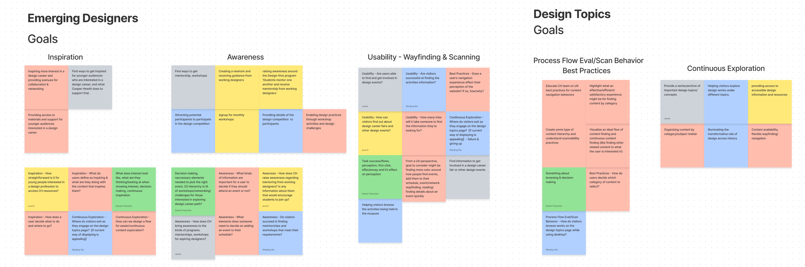
Emerging Designers
The client wants to encourage youth of today to explore a profession in design. Cooper Hewitt provides several opportunities for these 'young designers' to interact, learn, and network with others in the profession. To stimulate that first inspiration, the website should make these 'young designers' aware of their options by providing an effective navigational experience.
Design Topics
The client, wants to know how to develop an experience that organizes their information by category. They feel that categorizing information by category is the best way to navigate and locate articles and other design resources in their library. However, they are unsure of what that experience should entail and would prefer additional information about the practice.
As a research team, we will focus on discovering how users find Cooper Hewitt's offerings and which events/workshops they want to attend. Also look at current content library, evaluating if information is relevant for their needs, and reading/scanning available articles.
We prepared a thorough script that contained the introduction, pre-task, tasks, and post-task questions. Our efforts centered on the core aspects where we designed to run our study, the 'Emerging Designers' and 'Design Topics' pages, and how people interacted with those pages. We obtained feedback from the users on the experience after they completed the tasks. By showing them the recorded video of the screens from their testing and asked them to talk aloud their about their thought process. We then requested that they complete the System Usability Scale (SUS) form.
We decided to utilise eye-tracking during moderated in-person user testing to get reliable data on the problem for our participants and why it was vital to address it. We used Pratt's Tobii pro lab tool to capture the eye movements and reactions of 8 individuals to the site.
To ensure we talked to the right people, we asked a few questions before each test. We believe these participants were a close reflection of those who would utilize the content seen on both the Emerging Designers and Design Topics pages.
Prior to testing with actual users, it is critical to do a pilot test on all tasks to ensure that everything works properly. It helped in the improvement of the test, methods, and tasks. The pilot tests help us identify the software's limits as well as methods to make the participants feel more at ease in the testing environment so that it seems more natural.
To ensure we talked to the right people, we asked a few questions before each test. We believe these participants were a close reflection of those who would utilize the content seen on both the Emerging Designers and Design Topics pages.
- All mentioned they would visit a museum at a minimum of 1-3 times a year.
- 50% said they would do so every few months
- 62% said they visit the museum’s websites
- 70% have attended some workshops in the past.
Prior to testing with actual users, it is critical to do a pilot test on all tasks to ensure that everything works properly. It helped in the improvement of the test, methods, and tasks. The pilot tests help us identify the software's limits as well as methods to make the participants feel more at ease in the testing environment so that it seems more natural.

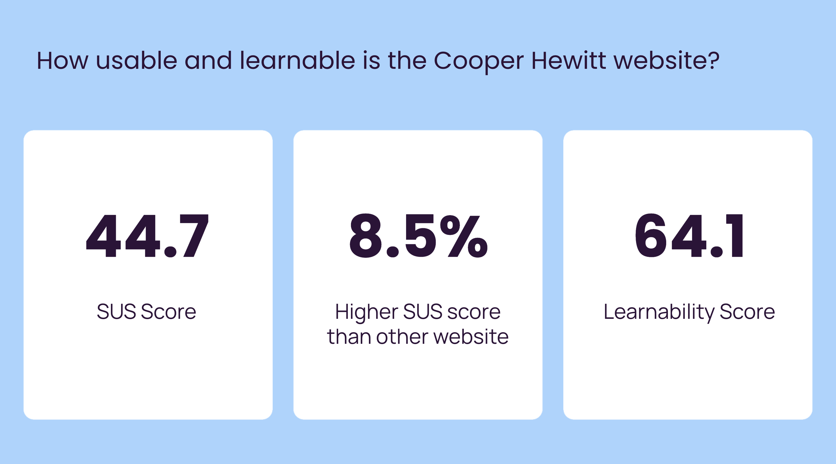
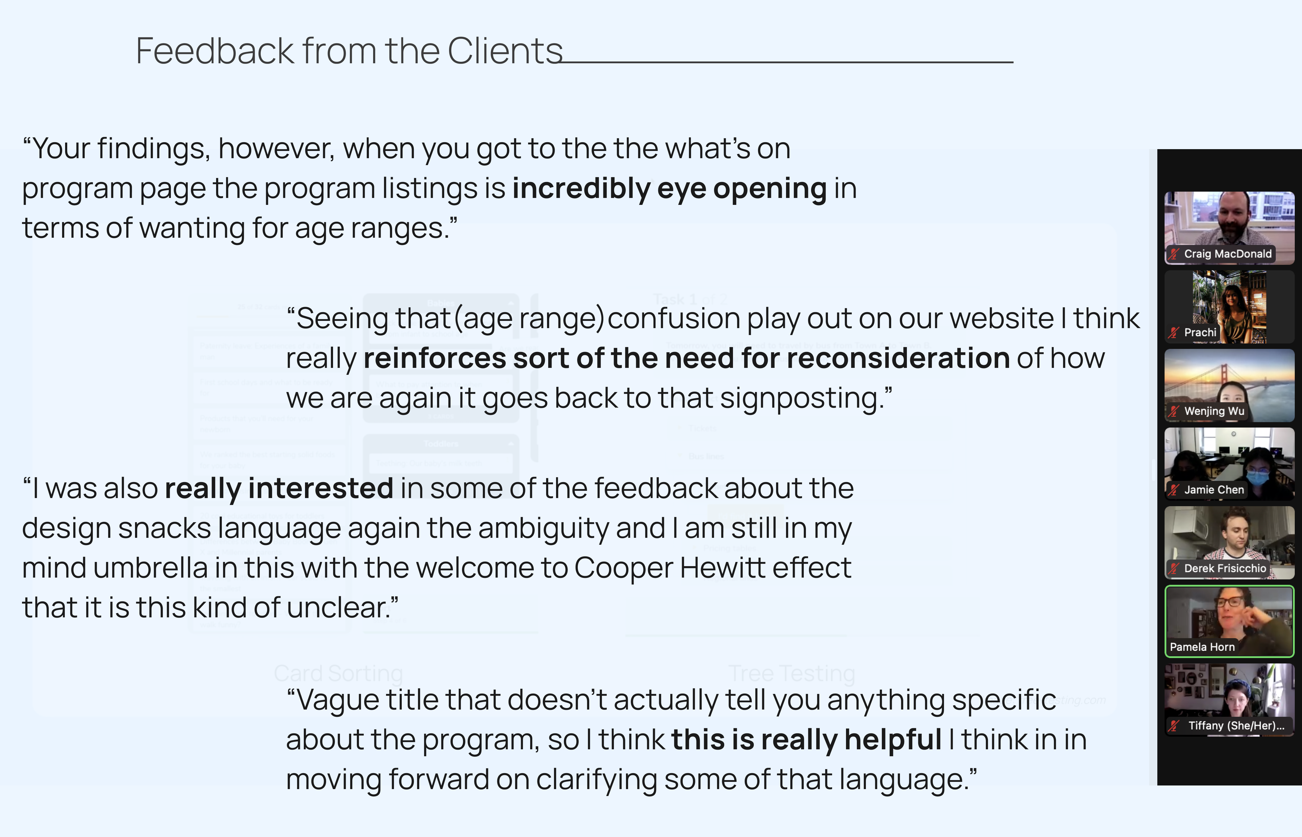
We had our participants complete a System Usability Scale, which informs us how easy the website is to use and learn. As an outcome, our SUS score was roughly 44, which is 8.5 % higher than other websites, and our learnability score was 64.1.
This demonstrates that our consumers were dissatisfied with the Cooper Hewitt website's usability and learnability. We received a higher learnability score than a usability score since many of our participants said that once they discovered where something was and how to get to the webpage, they could get the hang of it.
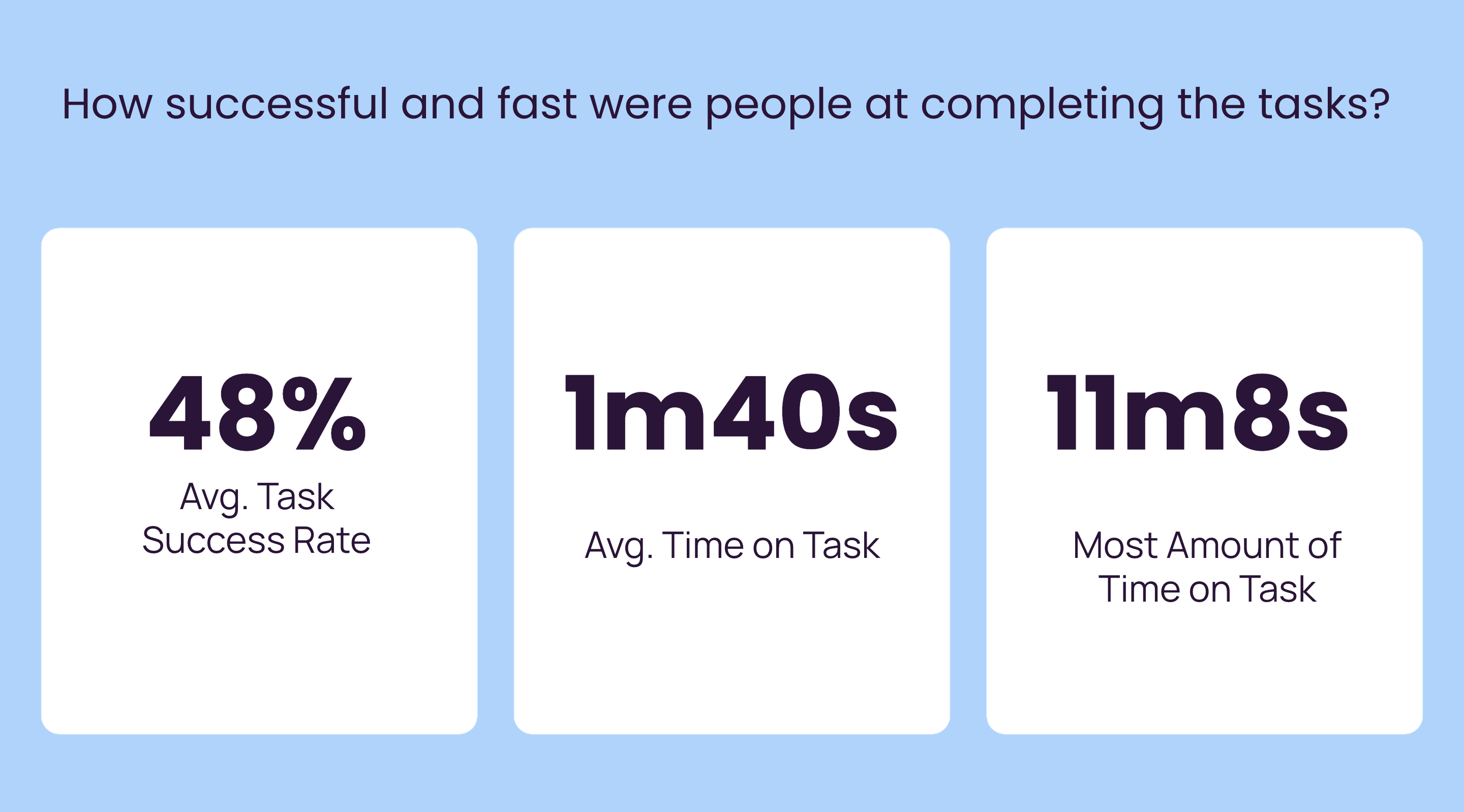
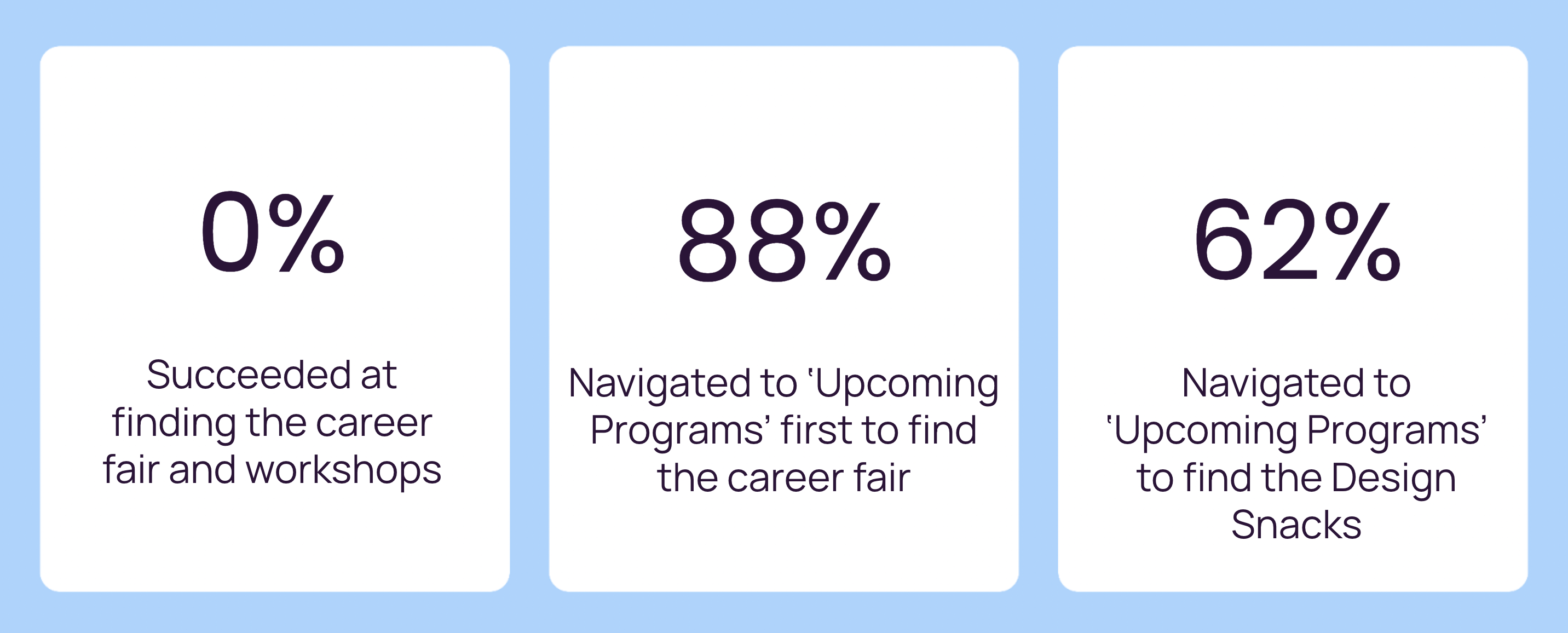
We also discovered that 48% of our participants finished our tasks correctly, taking an average of 1min 40sec each assignment. And the longest assignment took 11min 8s to accomplish.
So in the case of usability, there is room to improve. Finally, we asked our participants to walk us through their processes as we made them watch their own eye-tracking videos.
This demonstrates that our consumers were dissatisfied with the Cooper Hewitt website's usability and learnability. We received a higher learnability score than a usability score since many of our participants said that once they discovered where something was and how to get to the webpage, they could get the hang of it.
We also discovered that 48% of our participants finished our tasks correctly, taking an average of 1min 40sec each assignment. And the longest assignment took 11min 8s to accomplish.
So in the case of usability, there is room to improve. Finally, we asked our participants to walk us through their processes as we made them watch their own eye-tracking videos.


It was difficult to discover fairs and workshops.
Participants found the workshop by using age ranges.
- When participants were asked to discover an event for young kids, they believed it was for a specified age range/audience.
- They utilized images and the age in the description to determine they had discovered the correct event.
The arrangement of 'Upcoming Programs' was not suitable.
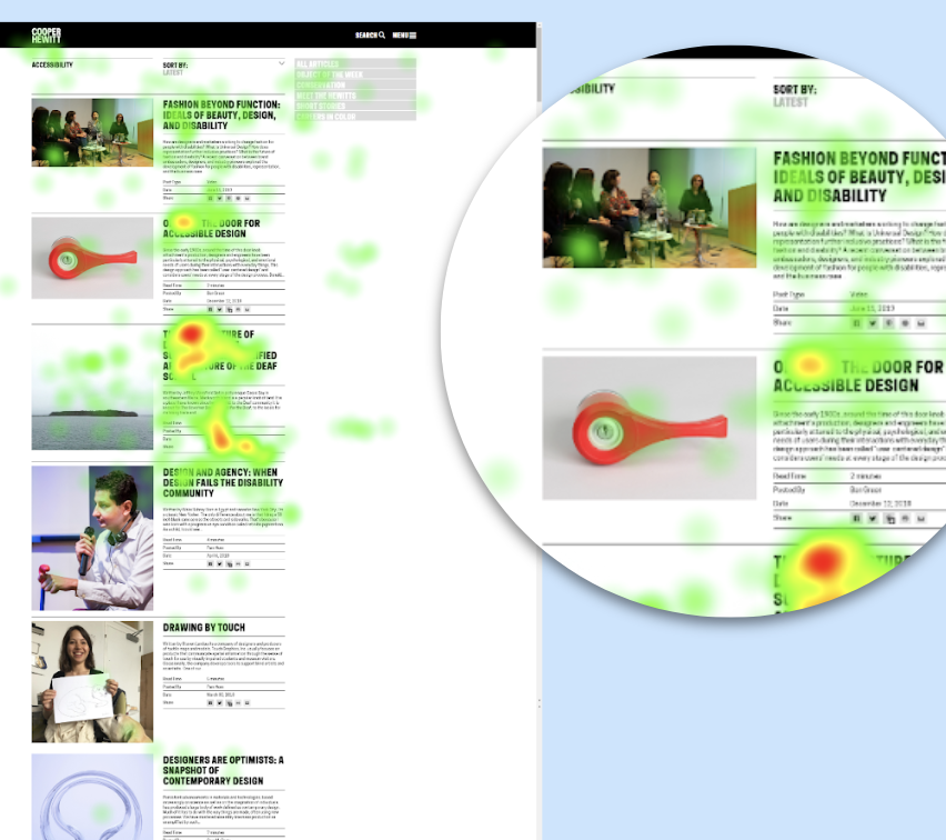
There is a lot of scrolling and eye movement in this participant's eye-tracking clip. They have trouble swiftly reading the list of activities, and because the events are spread out, they can only view one at a time.
-
Each event takes up the entire width of the page.
-
At any given moment, only one event may be shown.
There is a lot of scrolling and eye movement in this participant's eye-tracking clip. They have trouble swiftly reading the list of activities, and because the events are spread out, they can only view one at a time.

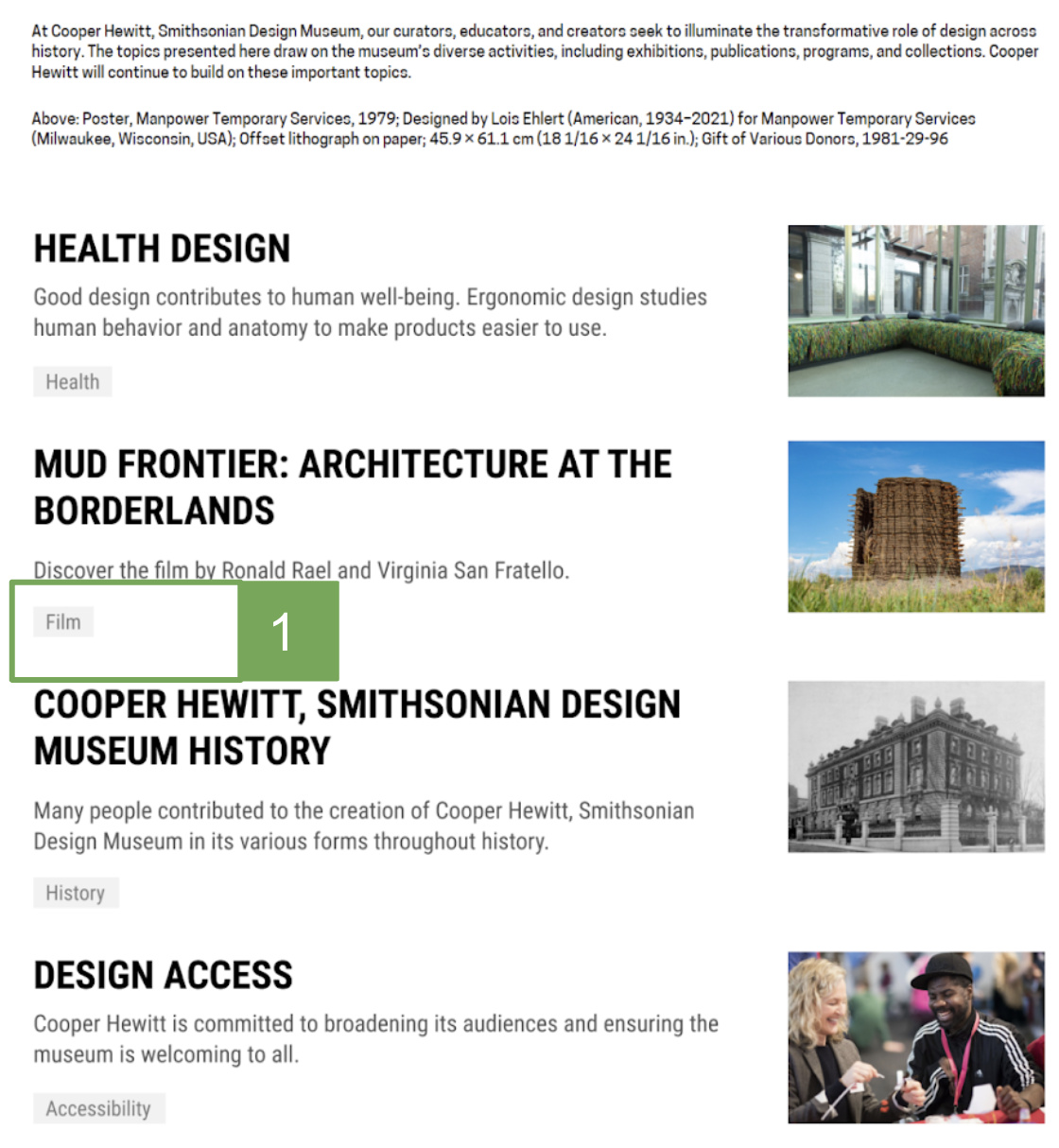
When navigating lists, people check the headers first.
Each block's title was scanned by the user.
-
They spent a significant amount of time reading the descriptions and looking for keywords.
- The title 'Design Access' puzzled users.
-
Headings receive the greatest attention, whereas descriptions are rarely read.
-
Images were rarely utilized to choose which answer to pick.
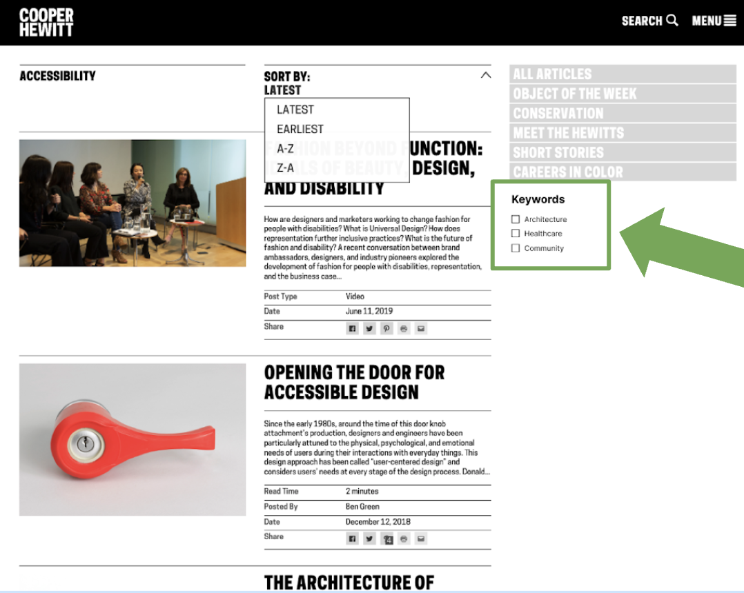
The sort by choices are insufficient.
Users did not spend too much time on sorting.
- Many of the Design Topics resources are text-based.
- Articles can only be sorted alphabetically or chronologically by users.
- It is unfavorable to users who are looking for results.

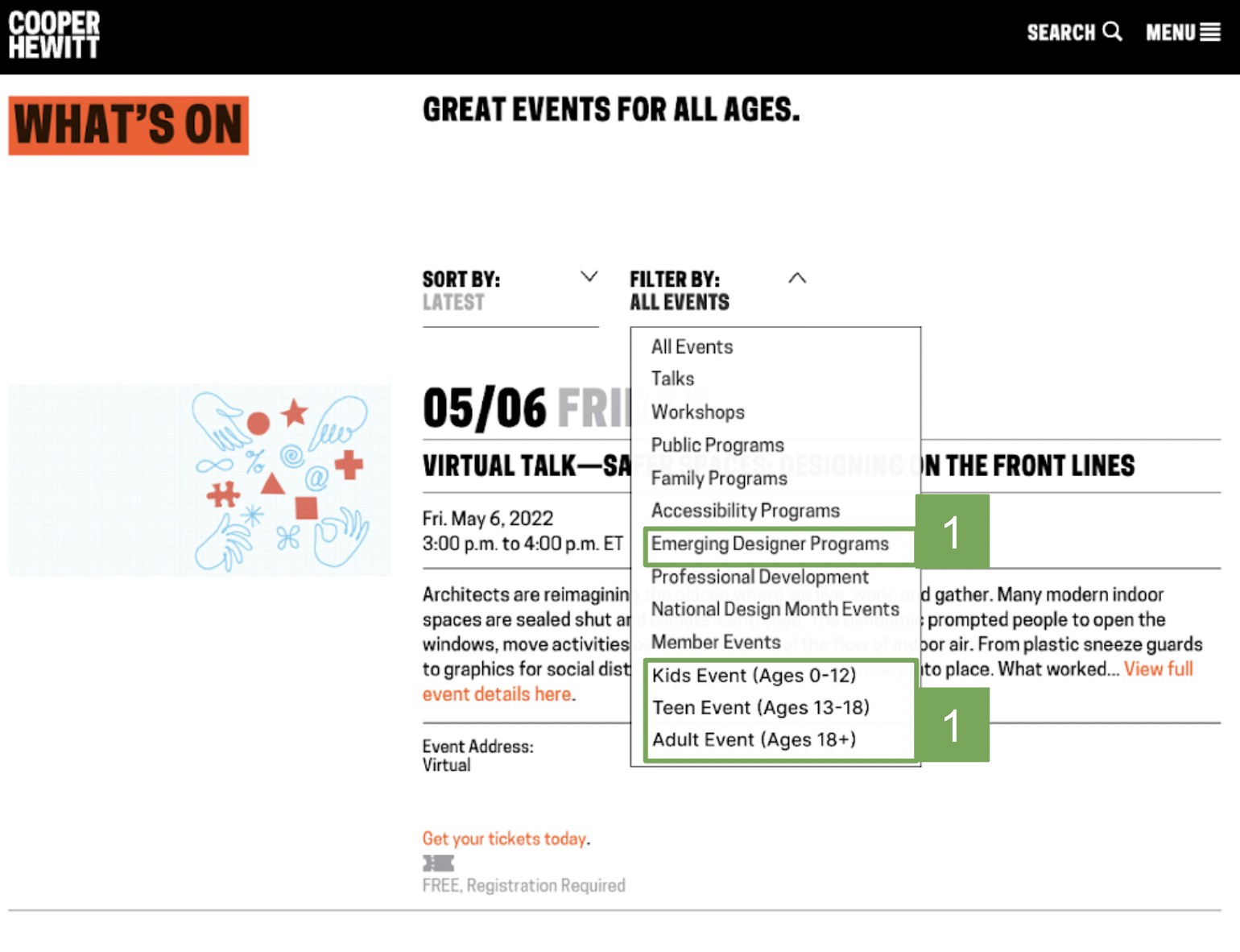
Place all 'Emerging Designers' workshops and events on the 'Upcoming Programs' page.
We propose improving the upcoming programs page by introducing more filter choices such as 'emerging designer programs' and age range options for kids, teenagers, and adults to ease the navigation of discovering material in the emerging designers page. We anticipate that discovering these workshops and career fairs through the emerging designers website will become much easier.
We propose improving the upcoming programs page by introducing more filter choices such as 'emerging designer programs' and age range options for kids, teenagers, and adults to ease the navigation of discovering material in the emerging designers page. We anticipate that discovering these workshops and career fairs through the emerging designers website will become much easier.
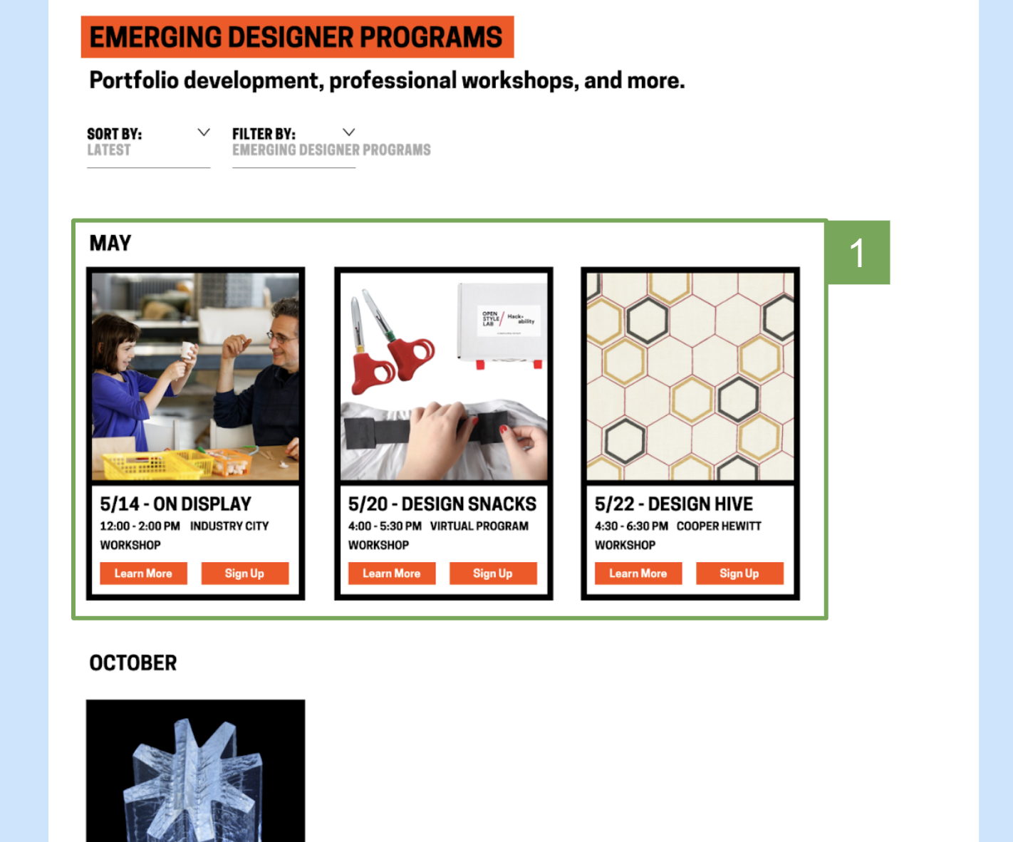
Create events in a grid, calendar-like style for faster and simpler scanning.
We recommend shortening the information and redesigning the style of the upcoming programs page in a grid-like structure so that more events may be seen at once.
We recommend shortening the information and redesigning the style of the upcoming programs page in a grid-like structure so that more events may be seen at once.
Each part should have keywords or tags. Change the grid structure and make the explanations shorter.
To begin, add tags to each title. The title with rhetoric is difficult to interpret for users from various cultural backgrounds. Tags with simple categories can help consumers understand the subject better. Second, we propose modifying the grid structure and reducing descriptions because customers seldom read the entire Description and generally stop at the second line. The titles are highlighted. Meanwhile, concise descriptions and tags assist users in efficiently raising awareness of issues.
To begin, add tags to each title. The title with rhetoric is difficult to interpret for users from various cultural backgrounds. Tags with simple categories can help consumers understand the subject better. Second, we propose modifying the grid structure and reducing descriptions because customers seldom read the entire Description and generally stop at the second line. The titles are highlighted. Meanwhile, concise descriptions and tags assist users in efficiently raising awareness of issues.
Add a 'keywords' feature to let readers narrow down articles based on their interests.
Then we made two recommendations. To begin, add tags to each title. The title with rhetoric is difficult to interpret for consumers from various cultural backgrounds. Tags with simple categories can help consumers understand the subject better.
Then we made two recommendations. To begin, add tags to each title. The title with rhetoric is difficult to interpret for consumers from various cultural backgrounds. Tags with simple categories can help consumers understand the subject better.
Reflection✨
We learned a lot during the eye-tracking assessment testing procedure. However, while our recommendations are supported by the evidence we have gathered, it is impossible to assess their long-term efficacy. Implementing these suggestions should result in some changes in the website's user engagement.
During this study, I did my first in-person user interview. It was a fantastic learning experience, and I learned the fundamentals of communicating with people while administering assessments.
Working with new tools like Tobii Pro and analyzing data helped me develop new technical abilities. We were also learning the program while doing testing, so it was a bit time-consuming factoring in the learning curve.